Currently no, because with the existing X3 grid system (without "crop"), images will expand to the width of container, which means the height will expand relative to the aspect of each image. This in turn means that each row's height will be decided by the tallest image in the row. Natural flow in HTML ...
The only way to achieve something like that, is to predefine the exact size of image containers (so they are all identical, usually symmetrical square), and then force each image to scale within it's container. You can achieve something like that in our
Files app demo (click layout > Grid, and uncheck "cover"). I made a screenshot, where I also removed the container background color as in your screenshot. In my opinion, this is inconvenient and clumsy to view for the visitor as there is no symmetry when they scan images from left to right.
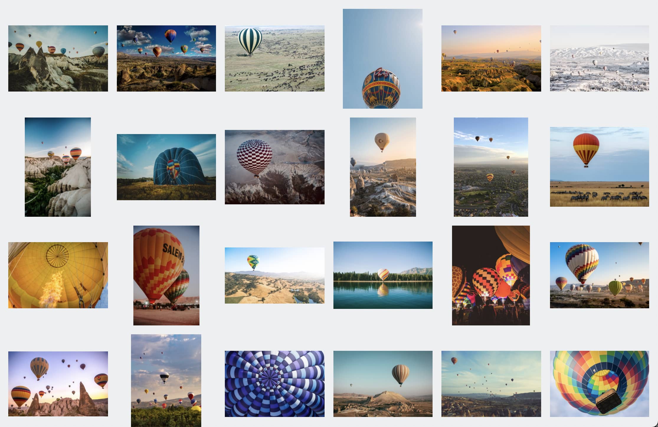
If anything, I would want to keep a background color to keep the elements symmetric, making it easier to view, like in the default Files app non-cover mode.
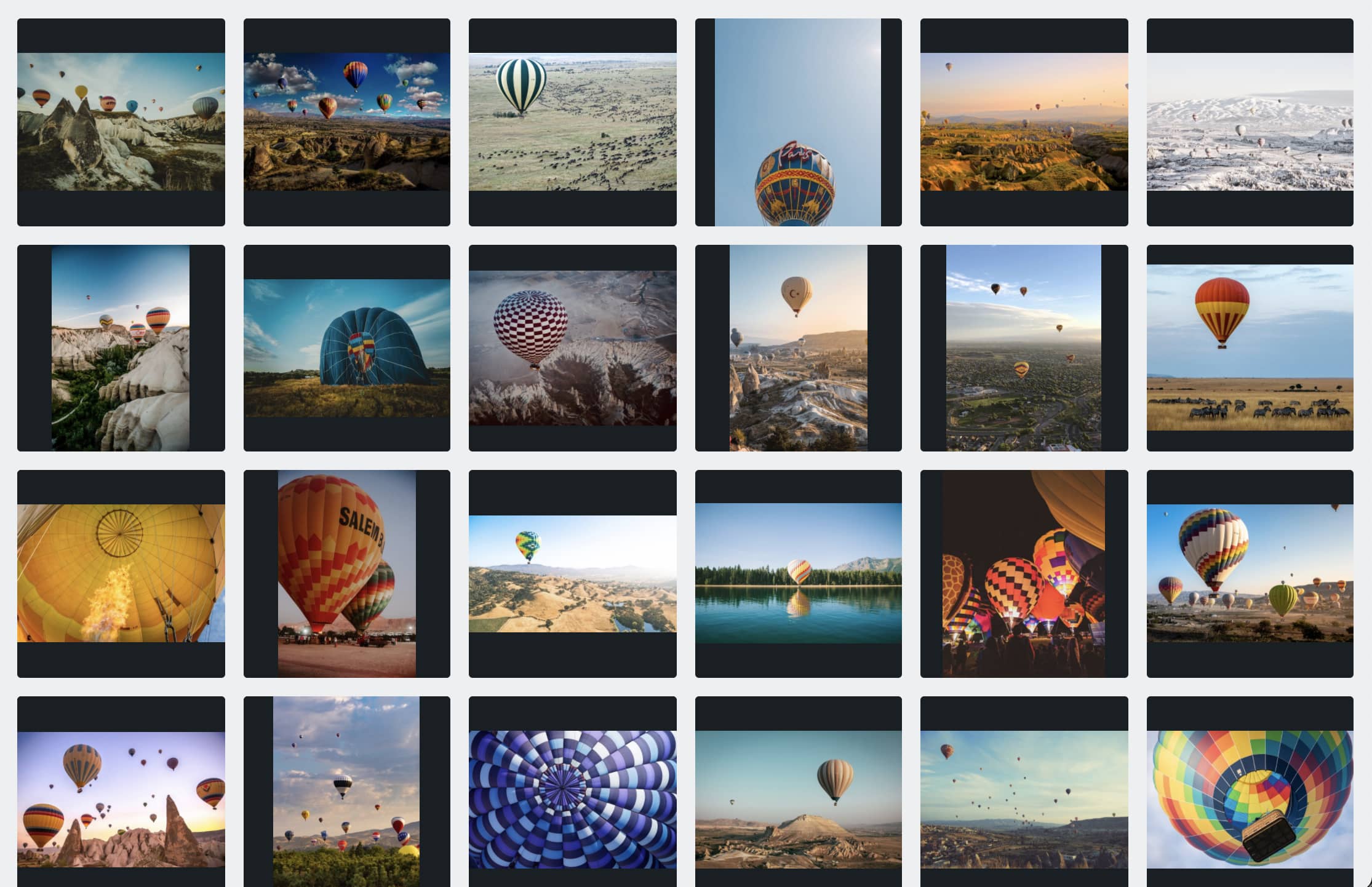
The above feature (using CSS grid) will eventually find it's way into X3, but even this layout is quite complicated, because we have to scale the width of all grid elements to fit available width, while maintaining a perfectly square aspect ratio for each element (height must increase proportionally with width).
Looks like some concept and not something actually created? I would note that this image seems to be designed with a very "fortunate" order of images vs aspects that creates more visual symmetry than you will normally get from such a layout.
